
Compare All the Paint Colors of the Year for 2024

Updated: Feb. 01, 2024
All there is to know and love about this year's crop of paint Colors of the Year, plus ideas on how to use them.
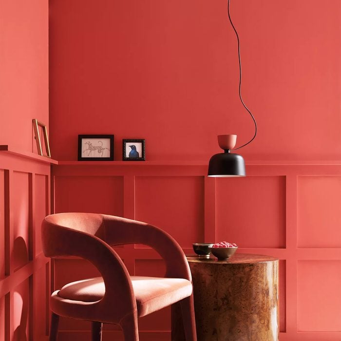
Raspberry Blush
To create a wow factor in your home, Andrea Magno, Benjamin Moore’s color marketing and development director, presents Raspberry Blush, its Color of the Year.
“We have seen a progression towards warmer, more saturated colors, and we have been drawn to corals and terra cotta hues,” she says. “We felt that 2023 was the right time to highlight a dynamic, expressive color that takes people out of their comfort zones.”
The saturated red-orange would be at home as an accent wall or in a dining room. Need more inspiration? Raspberry Blush is part of a Color of the Year palette that includes Conch Shell, Wenge, Cinnamon, New Age, Starry Night Blue, North Sea Green and Savannah Green.
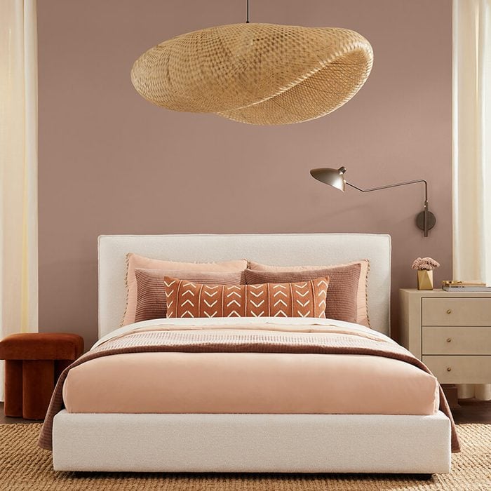
Redend Point
“Redend Point represents warmth and empathy, two themes that are central to the 2023 Color of the Year,” says Sue Wadden, director of color marketing with Sherwin-Williams.
“We’re continuing to see neutrals warming up and people embracing earthy elements, and this hue reflects those ideas. The color also leans into the macro trends we’re seeing around empathy and care culture. While self-care is incredibly important, care is also about looking out for each other and our communities.”
Wadden recommends Redend Point for its versatility, but she loves it for entryways or social areas like dining or living rooms. It’s also a “cosmetic tone,” she says, which makes it great for beauty-routine spaces such as a bathroom or bedroom.
Not ready for that much color? Use it as an accent. “I like to do this in unexpected ways,” she says. “For example, you could bring the hue into a space through small accessories that make a big impact, like painting a lamp.”
Blank Canvas
Behr Paint Company’s Blank Canvas is exactly that — a clean, warm white that can clear a space and provide a backdrop to any decor. Erika Woelfel, vice president of color and services at Behr, says that after years of uncertainty, Behr wanted to deliver a sense of renewal.
“Blank Canvas is the ultimate color of renewal and fresh starts, with transformative power that clears the air and provides a clean background for endless design and decor possibilities for 2023,” she says.
Vining Ivy
More than 30 color experts convened to choose Glidden’s Color of the Year — the is-it-blue-or-is-it-green Vining Ivy.
“Our color experts found that consumers are seeking to simplify in this post-COVID era, as the past two years have shed a new light on the importance of serenity and little moments,” says Alyson Ferrari of PPG.
“The blue and green undertones create a luxe, ultra-trendy color that is both calming and energizing — the perfect mood as we cautiously emerge from the pandemic, ready to live our best lives.”
Ferrari continues: “For those looking for a more luxurious feel, Vining Ivy can easily go glam when accessorized with golden accents and bright white trim. Those who love this moody hue but are still feeling color shy can treat themselves to the understated elegance of a teal accent wall or make a statement with Vining Ivy on their kitchen cabinetry.
“For those short on square footage but big on style, we recommend using this rich hue as bold contrast to a neutral palette, making a petite room feel plush.”
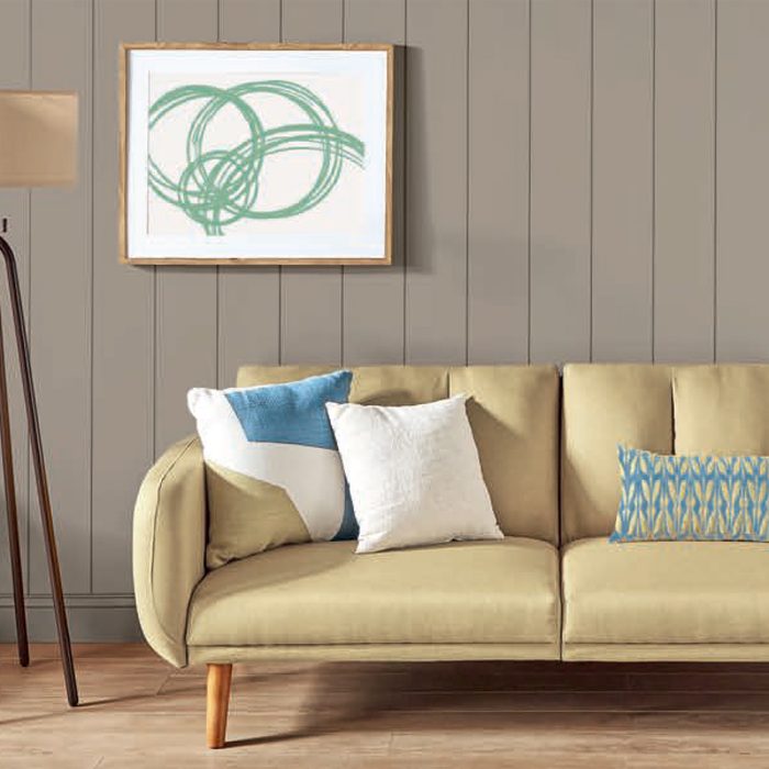
Rustic Greige
“The importance of overall well-being remains a primary focus in everyday lives,” said Ashley Banbury, a senior color designer at Dutch Boy Paints. “That’s why more DIYers are dedicating time and energy to designing personal spaces that make them feel cozy, protected and calm.”
Rustic Greige is a medium-toned neutral with a slight red undertone that will cover in one coat. “It’s all about the need to escape, relax and recharge,” Banbury says. “It’s about retreating to a calmer, simpler lifestyle inspired by the peace and clarity of tones derived from nature.”
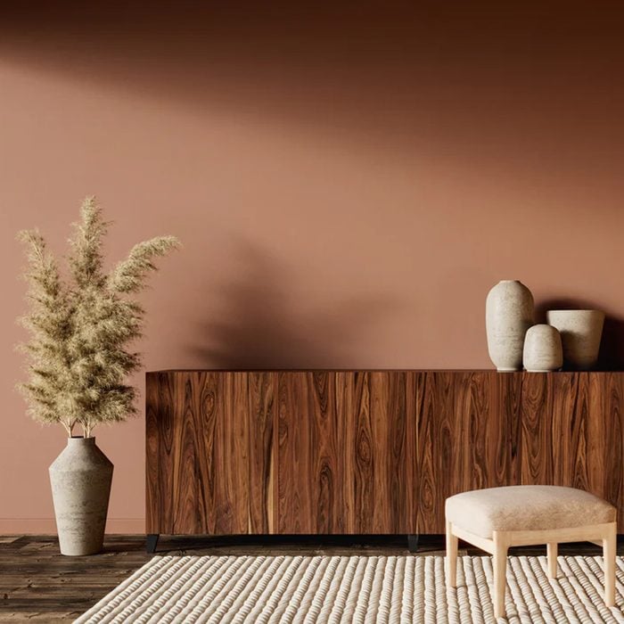
Tiramisu, Stout and En Pointe
C2 Paint Color and Design Specialist Philippa Radon says the more they experimented with Tiramisu, the more they felt connected to its rich, restorative color and reference to earthy elements like clay and soil.
“Tiramisu’s versatile cedar tone reflects our need for connection and grounding, especially when we were all physically disconnected,” she says. “Also, to keep us grounded in a digital world, we wanted a color that reinforces a sense of self and provides a lifeline to the world outside.”
Tiramisu is paired with blackish Stout and nearly white En Pointe to make color planning easy.
“All the colors are interconnected and interchangeable,” she says. “Based on your comfort level with color, you can mix them in any fashion by choosing a dominant color and one or two accent colors. The color-shy might choose En Pointe for a primary color, then use Stout on woodwork, with Tiramisu-inspired accents.”
Want a splash of color? “You could confidently introduce a blue, like Harmonic or a soft green like Peppermint,” Radon says. Rice Paper, a soft, pale pink, is one of her favorites.
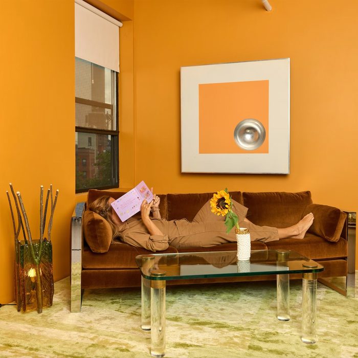
Color of the Year
Backdrop collaborated with Helena Barquet and Fabiana Faria, founders of New York furniture design and gift shop Coming Soon, who share Backdrop’s tongue-in-cheek sense of humor for their paint Color of the Year. It’s name? Well, Color of the Year.
Natalie Ebel, co-founder of Backdrop, describes it as a “vibrant yellow-orange” that is “equal parts Bottega Veneta rain boot and an everyday object, like a rubber band.”
Ebel says “the process was really about introducing a sense of fun and play into the whole ‘Color of the Year’ design industry cycle. The color can … lend a sense of vibrancy and warmth to virtually any space in your home. It also pairs beautifully with some of the other warm tones in our palette, like Tan Lines, Pablo Honey, or Ghost Ranch.” Now that you know the color of the year, take a look at the paint color mistakes to avoid this upcoming year.
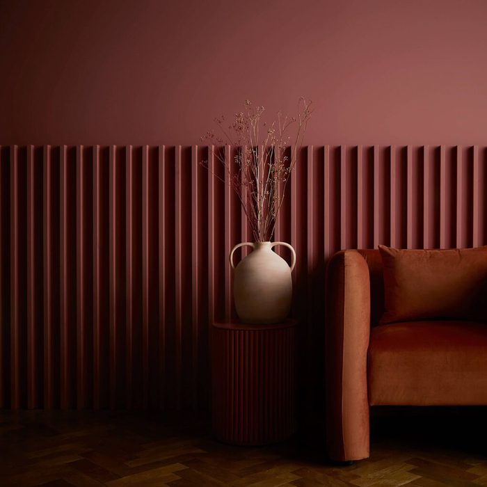
Alizarin
Graham & Brown’s in-house design studio brought life and color to long-forgotten pieces in the 75-plus-year-old archive, focusing on recycling and rejuvenation. Alizarin was chosen in part to find the Flawsome trend, shown through upcycling and restoration, bringing beauty to previously hidden objects and giving them a second life.
The company describes Alizarin as a deep and moody yet refreshingly warm auburn hue. It’s an agreeable alternative to gray and beige. It can be used in small spaces to create a cocooning effect, or in larger rooms to make a space feel opulent.
Originally Published: January 22, 2021