Interior designers and color experts agree: If you want a top color for your interior, turn to nature.
Our editors and experts handpick every product we feature. We may earn a commission from your purchases.Learn more.


Updated Aug. 31, 2024
Interior designers and color experts agree: If you want a top color for your interior, turn to nature.
Our editors and experts handpick every product we feature. We may earn a commission from your purchases.Learn more.
 via merchant
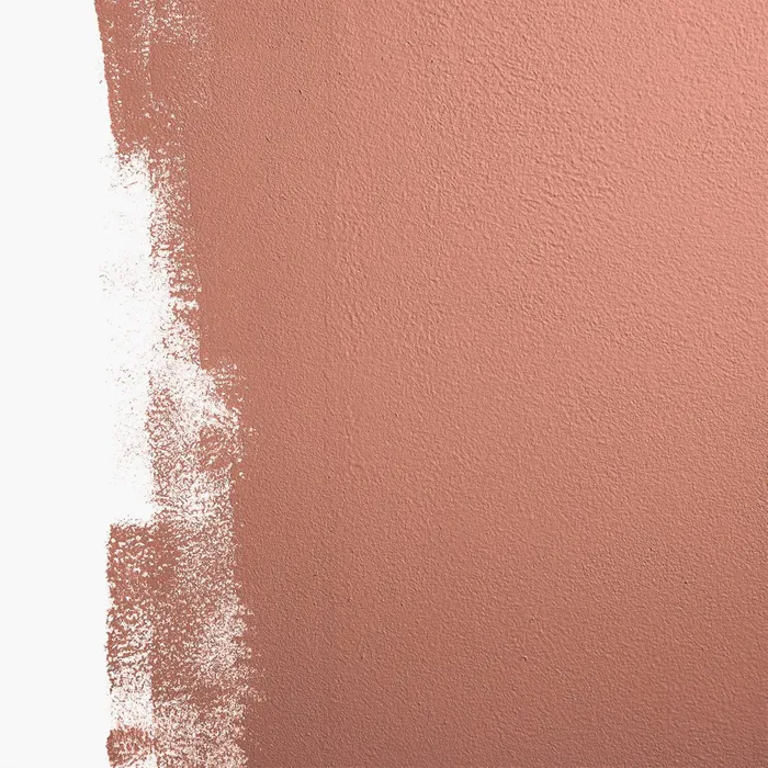
It’s time for those terra-cottas, deep browns and soft earthy tones to come back into the limelight,” says Jen Guerin, color and interior designer of JG Color Studios. “Another result of living in a pandemic is that we crave a huge hug from a softened interior color palette and the all-white interior is no longer cutting it.”
Guerin loves Dunn Edwards Color of the Year: Arts and Crafts. She describes it as a “deep terra with a richness that creates a ’70s throwback while bringing in the new modern softness.” Want something with a little more blush in it to help the room glow? She recommends 36 hours in Marrakesh by Backdrop.
 via merchant
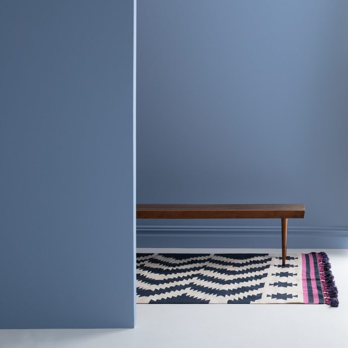
Despite a turn toward warmer colors, cool tones are still popping up. “It all started with the color of the year Veri Peri being called out by Pantone. Then all the periwinkles followed and then the other injections of colors that bring that oh-so-’70s vibe back and play perfectly with the new modern earth tones,” Guerin says.
Consider Benjamin Moore’s Stratford Blue or Fair Isle Blue as periwinkle options.
 via merchant
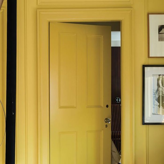
Yellow is making a comeback, too, says Guerin. “Some safe spots to try out colors are front doors, bath vanities and furniture,” she suggests if you tend to be color-shy. Feeling more on the bold side? “Guest rooms are the best way to visit a color-filled room without the commitment, or even in a mudroom or entry, so you can experience the fun,” Guerin says. She likes Farrow & Ball’s Citron.
 via merchant
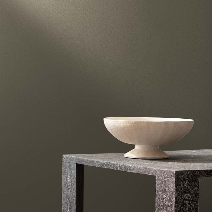
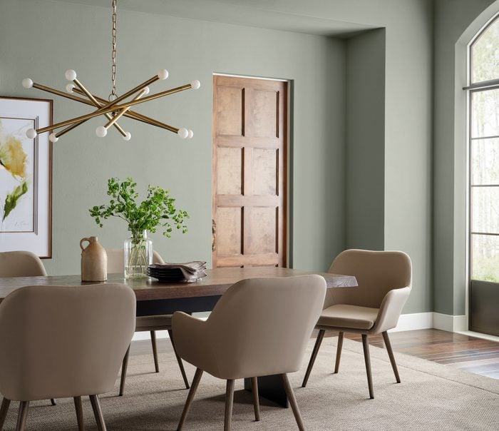
Mellow olive greens are hot, hot, hot, says Geoff Sharp, president and owner of Sharper Impressions Painting. His pick is the lighter end of the spectrum: PPG Paints’ Olive Sprig. “This would be a great modern color to paint your home office or living room without being too gaudy,” he says. “These types of olive colors have taken over the popular and safe ‘greige’ colors we have seen in the past. The olive family of colors brings more depth to any home’s walls.” For a deeper option, consider Benjamin Moore’s Aegean Olive.
Psst! Ever seen a color at some place you really want to match? This colorimeter will get the job done.
 via merchant
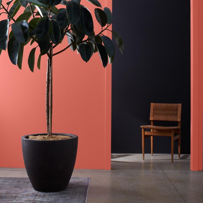
Sharp says black is 2022’s power color. “A black with some depth can make a piece of furniture, cabinetry, ceiling or accent wall demand your guest’s attention,” he says. He suggests PPG Paints’ Onyx, which has a stone-colored undertone. “It brings a dominant color to any room without being overbearing,” he says, adding that it’s been very popular on kitchen cabinetry, including islands. Want another option? Anna Franklin, interior designer and founder of Stone House Collective recommends Black Panther by Benjamin Moore because it is a “beautiful bold, yet soft, black that doesn’t come across too harshly.” She also loves it on cabinetry, pairing it with white or cream walls and gold-toned hardware. Planning to sell your home? Here’s the most popular paint color to sell your house in a snap.
 via merchant
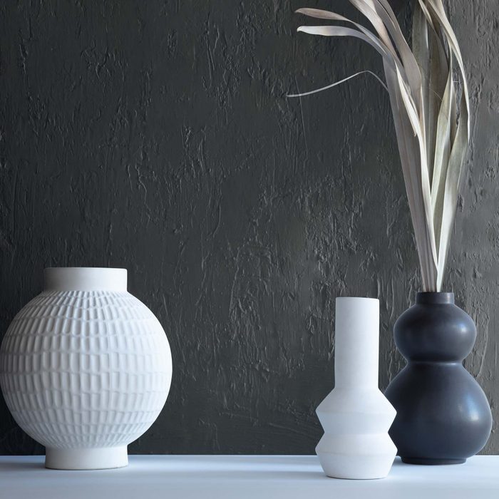
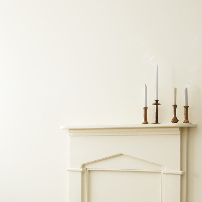
Super-stark whites are waning. But, whites with warmer undertones are still hot. Interior Designer Jil Sonia of Jil Sonia Interiors says that creams, such as Alabaster by Sherwin-Williams, work with almost all flooring and in all situations. “It’s warm and it feels like the room is giving us a big hug,” she says. If you want to move away from the classic Benjamin Moore Simply White to something slightly warmer, she recommends White Dove.
If this is your style, don’t forget to also explore the latest trend in home design- quiet luxury.
 via merchant
Bolder and darker greens are still in style, but there’s a shift happening on the green front. “We see the trend transition into the blues and greens of nature and earth, like Sherwin-Williams’ 2022 Color of the Year Evergreen Fog or Rainwashed,” says Sue Wadden, director of color marketing for Sherwin-Williams. Although blues and greens are not typically considered neutrals, Wadden says that there’s definitely a trend toward moving shades like these into neutral territory. Going with too many shallow neutrals in a living space can be a common paint color mistake.
 via merchant
Need a bolder option to play against these mostly mellow hues? Benjamin Moore’s Wild Flower is it. Think of it as playing off the earth-tone hues but taking it up a notch with a garden inspiration. Pink and orange undergird this bolder red. It looks great paired with subdued creams, or even gray-blues or navy colors that are still popular.
Originally Published: March 04, 2021