10 Front Door Color Ideas

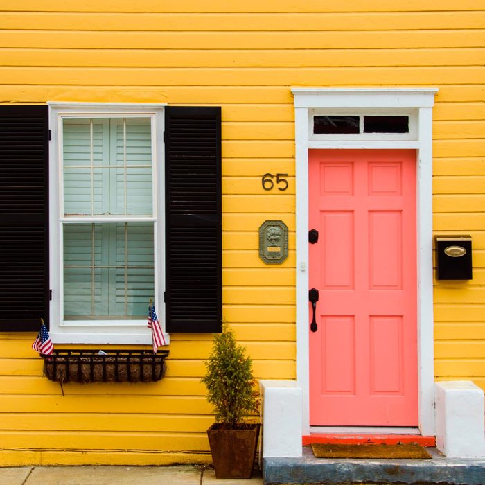
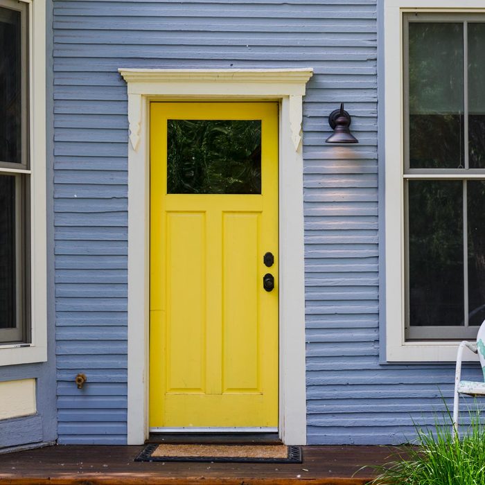
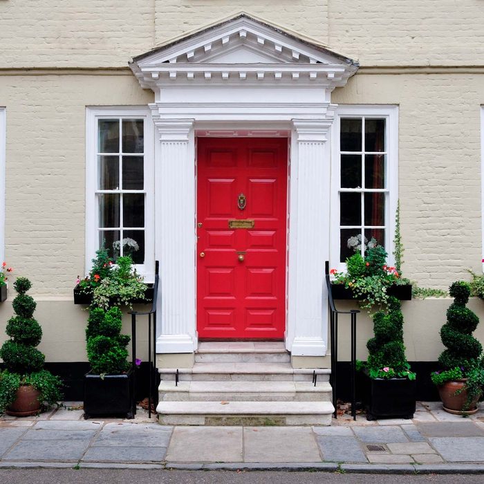
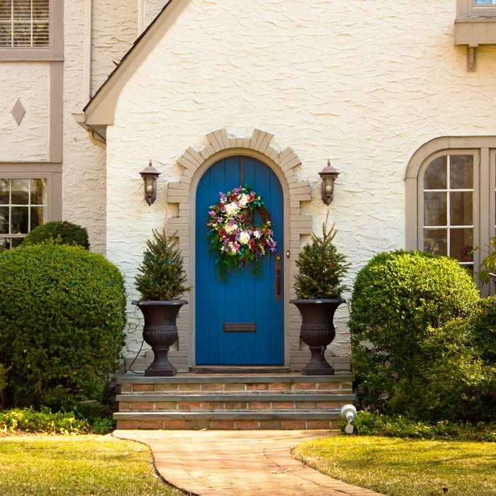
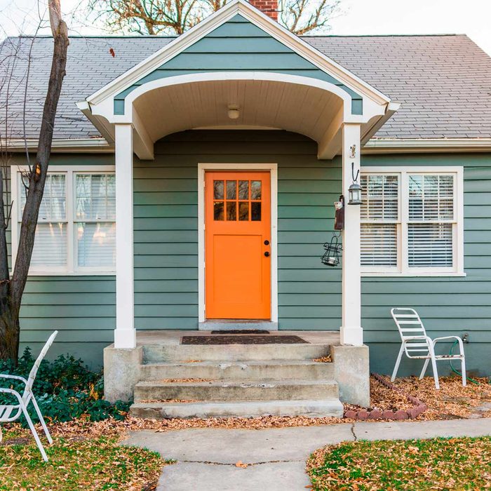
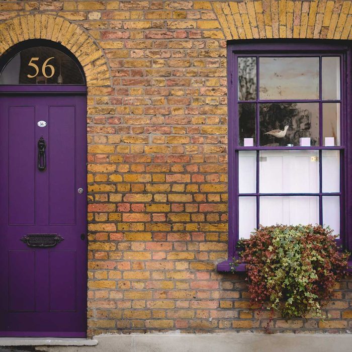
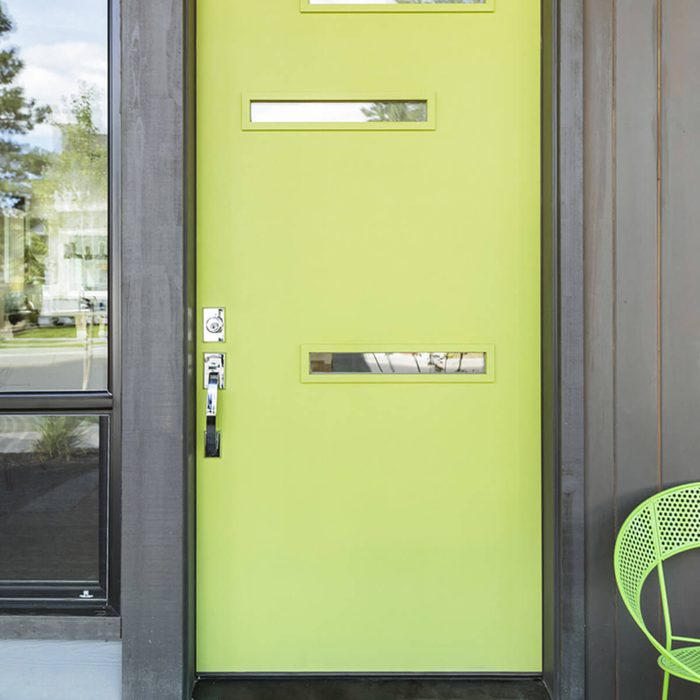
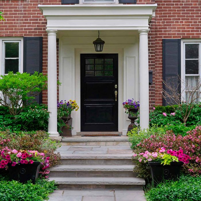
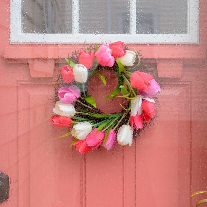
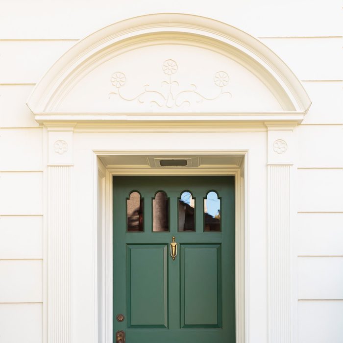
One of the fastest and cheapest ways to up your curb appeal is to paint your front door. Want to really make an impression? Opt for a fresh, fabulous color, even on traditional or neutral homes.

Our editors and experts handpick every product we feature. We may earn a commission from your purchases.

1 / 10
Colorful
Cristi Popescu/Shutterstock

Captivating Coral

This bright, happy blend of pink and orange enjoyed its peak of popularity in the mid-century 1900s. Now it’s making a strong comeback, perhaps because it’s easy to choose this paint color. It pairs as nicely with neutrals such as chocolate brown, tan, charcoal and white as it does with less traditional home exterior colors like cobalt, yellow and turquoise.

And no, if you paint your front door a fun coral, you don’t have to paint your shutters to match. Need color inspiration? Try Behr’s Flamingo Dream for a bold, fresh take.

2 / 10
door
Brian Goodman/Shutterstock

Not-So-Mellow Yellow

Yellow is the color of optimism and outgoing natures — everything you’d associate with the word “sunny.” Because of its inherent happiness, it feels fresh, friendly and carefree. That’s a welcome sight on cloudy days in particular. A yellow front door is welcoming and truly ups your curb appeal. Get happy with Behr’s Hawaiian Pineapple.

3 / 10
Exterior
1000 Words/Shutterstock

Really Red

Vibrant red is a classic choice for a front doors around the world, because it’s historically been considered a sign of welcome or safety. Choosing a glossy true red, such as Behr’s Flirt Alert in semi-gloss, will make neutrals and traditional design elements really pop.

Be prepared to repaint this door every year or two to maintain its pow factor, especially if it gets blasted with direct sunlight.

4 / 10
home
littlenySTOCK/Shutterstock

Bold Blue

Navy is never wrong. But if you really want to make a splash, consider bolder blue hues: indigo, cobalt, turquoise or French artist Yves Klein’s signature ultramarine. A universally pleasing color, it’s energizing and calming. And like a good pair of jeans, it goes with everything. Make your mark with Behr’s Dark Cobalt.

5 / 10
urban
Brett Taylor Photography/Shutterstock

Outstanding Orange

Nothing rhymes with orange, and perhaps that’s traditionally been the thought in design, too. But orange is also the chosen color of French luxury fashion house Hermés and champagne’s design darling Veuve Cliquot. With all of that designer love, it’s no wonder orange can make a major impression in terms of curb appeal. It’s bold and beautiful! Behr’s Tart Orange hits the target.

6 / 10
Purple
Paolo Paradiso/Shutterstock

Potent Purple

Historically, purple has been considered the color of royalty, so it’s no surprise that purple feels luxe. Purple, from lavender to violet to raisin, is also surprisingly versatile. It plays well on Victorians and Painted Ladies to Craftsman and mid-century homes. Behr’s Deep Violet is one such pick.

Vibrant colors need a good primer. Make sure you know how to choose and use primers effectively.

7 / 10
Lime Green Front Door with Matching Chair
David Papazian/Shutterstock

Charming Chartreuse

Chartreuse is a natural fit for vibrant, geometric mid-century homes and as a foil against equally intense, deep hues. But — surprise! — it also looks perfectly in place against more traditional architecture and neutral colors, such as a cool white or a dove gray. Pair Behr’s Anime with white or indigo to really deliver a color punch.

8 / 10
entrance
Spiroview Inc/Shutterstock

Not-Basic Black

Black is always the new black. Elegant and bold, it provides a bookend to a brighter exterior color, particularly when paired with black shutters. It can also act like a tuxedo by dressing up neutral materials on your home’s exterior.

Feng shui practice notes that black provides a protective shield — a perfect choice to create a feeling of safety and security in your sanctuary. We like Behr’s Totally Black.

You’ll want a hardy paint to stand up to the elements. Read these pro tips to pick the right outdoor paint.

9 / 10
Pink
Kristen Prahl/Shutterstock

Think Pink

No longer just the domain of baby nurseries, pink — from blush to peony — has finally started to be taken seriously. A fresh and sophisticated color choice, pink is inviting and cheerful, a brightening best friend to white, gray, navy and brown.

Avoid the sugary princess look with a sandy pink such as Behr’s Positively Pink.

10 / 10
Green
David Papazian/Shutterstock

Gorgeous Green

Forest, hunter, British racing, emerald: Dark greens are hot, hot, hot. While dark greens have been employed successfully for traditional interiors for more than two centuries, this color is also starting to appear on less-traditional home design palettes.

But don’t worry. Should you choose a deep green, it still looks stylish long after the trendiness has passed. Get a taste of the country right in the city with Hidden Forest by Behr.

Katie Dohman
Katie Dohman is an award-winning freelance writer who has written about various lifestyle topics for more than 15 years. She’s reported on spa bathroom designs, decor trends from every decade, pendant light fixtures and more for Family Handyman. Additionally, Katie’s work has appeared in Artful Living, Midwest Home, Star Tribune and Teen Vogue. She and her husband are currently working on a complete gut remodel of their 1921 home.